“`html
How to Properly Find the IQR: A Practical Guide for Accurate Data Analysis in 2025
The interquartile range (IQR) is an essential measure in statistics that offers insight into the variability and spread of data. Understanding how to find the IQR correctly is crucial for accurate data analysis, particularly in 2025’s era of big data where precise interpretation of data sets is needed. This guide provides comprehensive steps on the IQR calculation process, exploring its significance and practical applications in various fields.
Understanding IQR and Its Significance
The interquartile range (IQR) is defined as the difference between the third quartile (Q3) and the first quartile (Q1) in a dataset. It effectively measures the **middle 50% of data**, hence indicating the spread of data points around the median. Unlike the range, the IQR provides a more robust measure of variability by reducing the influence of outliers and skewed data distributions. Being well-versed in the **interquartile range definition** is vital for **data analysis**, allowing analysts to draw genuine insights from their results.
What are Quartiles?
Quartiles are the values that divide a dataset into four equal parts. To determine the quartiles, one must first arrange the data in ascending order. The first quartile (Q1) represents the 25th percentile, while the third quartile (Q3) marks the 75th percentile. In this manner, the **quartile calculations** form the backbone of the IQR calculation. By understanding quartiles, data analysts can evaluate **data distribution** more effectively, enhancing their analytical reports and predictive models.
The Role of IQR in Outlier Detection
Outliers are data points that fall significantly outside the range of most of the data, potentially skewing results. The IQR serves as a pivotal tool in **outlier detection**, as points lying below Q1 – 1.5 * IQR or above Q3 + 1.5 * IQR can be classified as outliers. This method allows analysts to identify and address data irregularities promptly, ensuring their conclusions remain statistically valid.
Applications of IQR in Statistics
The application of the IQR extends beyond simple calculations; it is instrumental in a variety of statistical methods, including the construction of **box plots**. Box plots visually represent the IQR and help in comparing distributions across different datasets. Furthermore, researchers apply the IQR to ascertain the **variability in datasets**, allowing for sharper insights concerning data trends. Ultimately, employing IQR enhances statistical inferences and interpretations in research.
Calculating IQR: Step-by-Step Process
Knowing how to calculate the IQR accurately requires familiarity with a streamlined process. The following sections detail the systematic approach to extracting this essential statistical measure, incorporating an **IQR formula** for clarity.
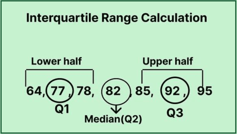
Step 1: Arrange the Dataset
To begin the IQR calculation process, arrange your dataset in ascending order. For instance, consider the dataset: 12, 15, 14, 17, 20, 13, 18. Ordering these numbers yields: 12, 13, 14, 15, 17, 18, 20. The first step is crucial, as it lays the groundwork for subsequent calculations of the quartiles.
Step 2: Calculate Q1 and Q3
Once the dataset is organized, determine Q1 and Q3. For a dataset with an odd number of observations, Q1 is the median of the lower half of the data, while Q3 is the median of the upper half. In the previous example, the lower half is 12, 13, 14, leading to Q1 = 13.5. The upper half—15, 17, 18, 20—results in Q3 = 18.5. Now that both quartiles are determined, they’re integral to **IQR calculation**.
Step 3: Apply the IQR Formula
The IQR formula is straightforward: IQR = Q3 – Q1. In our case, IQR = 18.5 – 13.5, yielding an interquartile range of 5. This value signifies the spread of the middle 50% of data points, an essential figure for understanding **data variability**.
IQR Interpretation and Statistical Insights
The interpretation of the IQR is pivotal for comprehending data distributions. A larger IQR indicates a wider range of values in the central data segment, whereas a smaller IQR suggests data clustering around the median. This aspect is particularly crucial in fields requiring a deep understanding of **quantitative analysis**. By assessing the IQR, researchers can make informed decisions that are backed by compelling evidence.
IQR in Skewed Distributions
When dealing with **skewed distributions**, the IQR remains a reliable measure of spread. Skewness can drastically impact mean and traditional range calculations, yet the IQR is resilient against these influences. For instance, if the dataset is right-skewed, the IQR will still reflect the true extent of the middle 50%, allowing analysts to better interpret and report their findings.
Visualizing IQR with Box Plots
Using box plots to visualize the IQR is one of the most effective ways to convey summary statistics. A box plot displays Q1, Q3, the median, and potential outliers, encapsulating critical information in one graphic representation. Understanding how to utilize a box plot analysis is key for effective **data visualization**, making it easier for audiences to grasp complex statistical insights at a glance.
Key Takeaways
- The IQR is a measure of variability that assesses the spread of the middle 50% of a dataset.
- Calculating the IQR involves arranging data, determining quartiles, and applying the IQR formula.
- The IQR is pivotal for identifying outliers and understanding statistical implications in research.
- Utilizing visual representations, such as box plots, enhances data interpretation and clarity.
- IQR holds significant relevance in **data analysis** across various fields and types of research.
FAQ
1. What is the IQR in statistics?
The IQR, or interquartile range, is defined as the difference between the third quartile and the first quartile in a dataset. It serves as a measure of statistical dispersion, highlighting the spread of the central 50% of values. This makes it a vital statistic for summarizing the distribution characteristics of a dataset, particularly when identifying outliers and understanding data variability in **data analysis**.
2. How do you calculate IQR for a skewed distribution?
To calculate the IQR in a skewed distribution, follow the same fundamental steps: first, arrange the data in ascending order, then determine the first (Q1) and third quartiles (Q3). The properties of the IQR make it robust against the effects of skewness, allowing for an accurate portrayal of data spread without the distortion often present in mean calculations.
3. Why is IQR significant in outlier detection?
IQR is particularly significant in outlier detection as it sets boundaries that identify values significantly beyond the central data spread. By calculating Q1 and Q3, and employing the 1.5 * IQR rule, analysts can effectively pinpoint which data points may artificially inflate or deflate analysis, ensuring that research conclusions remain valid.
4. Can you give an example of IQR application in research?
In research focused on income data, the IQR can elucidate salary disparities among different working groups. Analysts can calculate the IQR for various demographics to determine how widely incomes spread and identify segments with larger disparities. This approach helps in crafting data-driven policies and improving socioeconomic conditions.
5. What are the limitations of using IQR?
While the IQR is a valuable measure of data variability, it does have limitations. It does not account for the overall range of the data or how data points are distributed outside of the middle 50%. Additionally, using the IQR alone may overlook significant insights if outliers are numerous or if data patterns are skewed. Therefore, it is advisable to combine IQR with other descriptive statistics for comprehensive analysis.
6. How does IQR differ from the range?
While both the IQR and the range measure variability, the IQR captures the spread of the middle 50% of data, minimizing the impact of outliers. The range, on the other hand, measures the difference between the maximum and minimum values, offering less insight into the distribution’s central tendency, particularly when dealing with irregular datasets.
7. How can I visualize the IQR in my data analysis?
To visualize the IQR, constructing a box plot is one of the most effective methods. Box plots display the IQR, marking the quartiles, median, and outliers, providing a clear graphical summary of the data distribution. This visual representation greatly aids in interpreting statistical measures and presenting findings in analyses.
“`